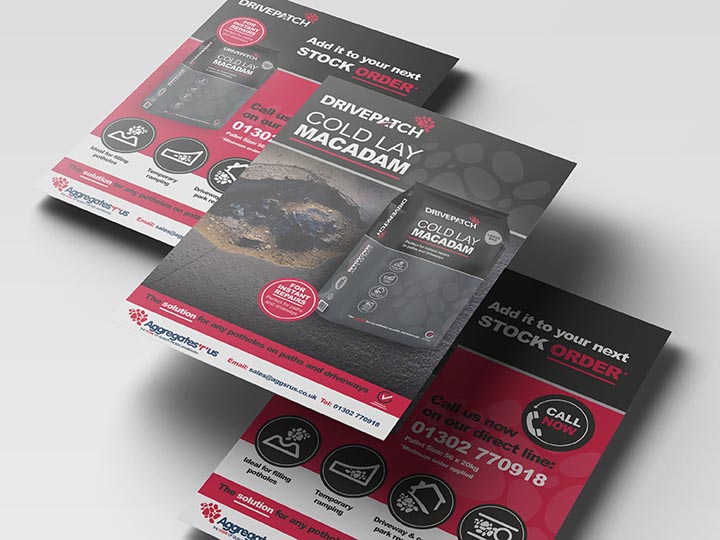
To build on their existing range of products, we needed to create a brand that had a relationship with their leading brand. The was important as when people see their full range, they are familiar and consistent.
WHAT:
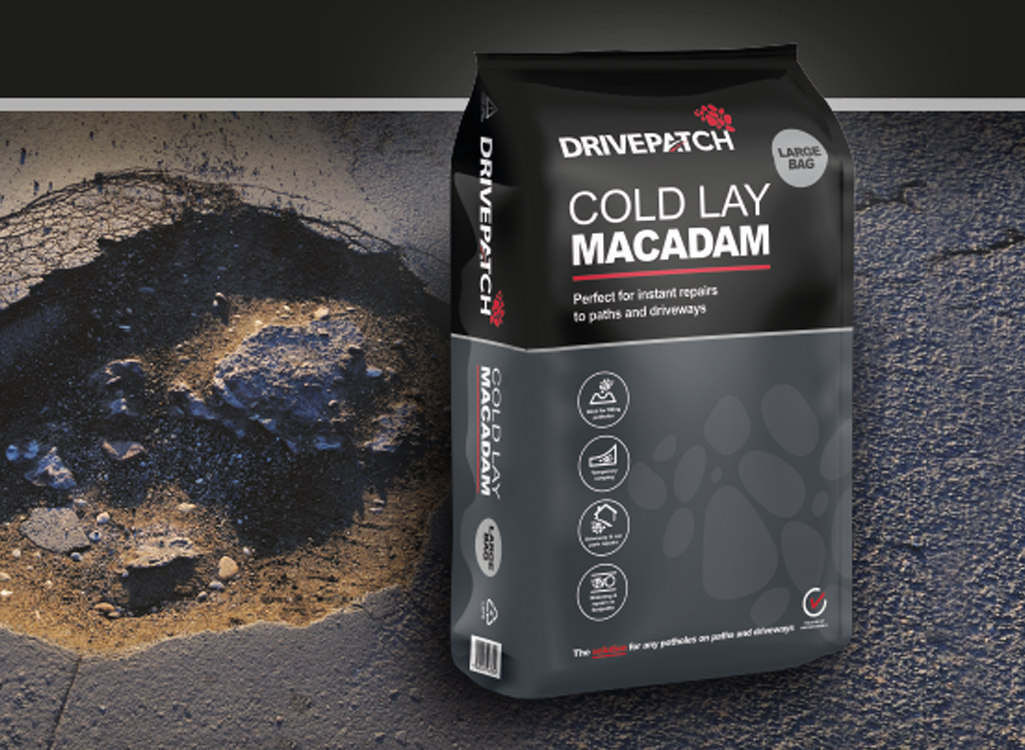
We proposed several designs incorporating the existing Aggregates ‘r’ us pebbles along with elements representing road marks. Hence, we created a symbol on the ‘A’ icon to clearly define the use of the product.
For all the new brand packaging we ensured it was kept clean and simple with the use of black & grey with bold accents of colour including touches of red.